
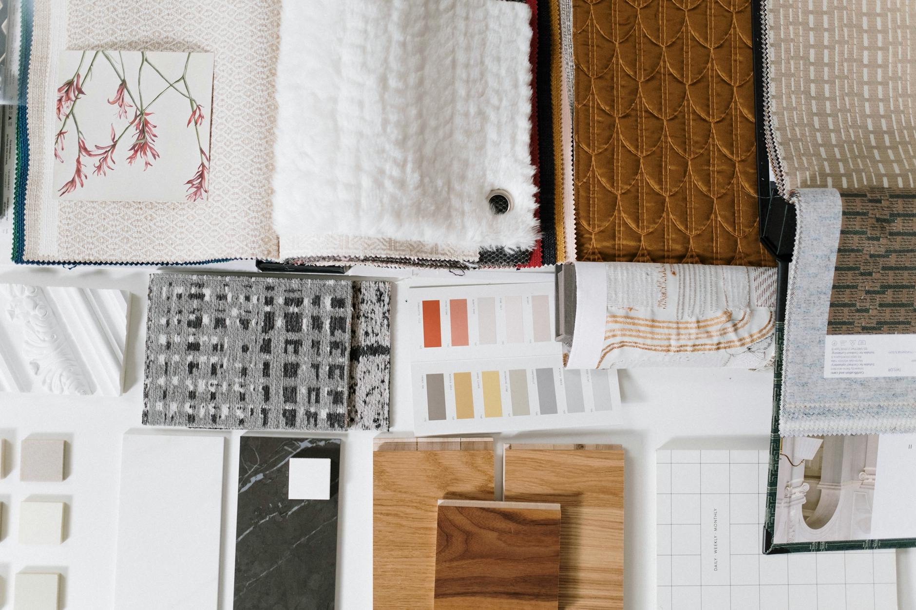
Moody earth tones are having a serious moment in custom fabric prints. Not the warm beige-and-cream palette that dominated the early 2020s, but something darker and more deliberate: deep terracotta, moss green, burnt sienna, slate, and bruised plum. These are the colourways filling preorder lists at independent fabric shops, and the prints selling fastest at markets. If you've noticed your customers gravitating away from brights and pastels without quite leaving colour behind, this is the shift they're responding to.
Why this palette is resonating now
The timing is not accidental. After several years of maximalist brights and then a swing toward bleached linen neutrals, many sewists want colour with some weight to it. Moody earth tones deliver that. They feel intentional rather than trendy, and they photograph beautifully on both dark and light backgrounds, which matters enormously for sellers listing on Instagram or Etsy.
There is also a strong overlap with the nature-forward design movement. Moss, clay, bark, and deep water are all colours lifted directly from the natural world, just pushed into shadow. That connection gives the palette an emotional coherence that abstract colour trends often lack. Customers can articulate why they love a fabric in ochre or forest green in a way they often can't with a colour that's purely fashionable.
It's worth noting how this differs from the retro earth-tone revival. 1970s-inspired prints leaned into orange, avocado, and harvest gold. This current palette skews deeper and less saturated. Think a terracotta that's had the brightness dialled back by 30 per cent, or an olive that tips toward khaki-brown rather than lime. The mood is quieter, even when the print itself is complex.
The specific hues selling right now
Based on what's moving in custom preorder fabric and handmade markets, five tones are consistently appearing in the most-requested colourways this year.
- Deep terracotta: Not the bright burnt orange of a few years ago. This version is darker and slightly brown-shifted, closer to old clay pots than fresh paint.
- Moss and forest green: Low-saturation, cool-shifted greens that work as either a background or a print colour. They pair beautifully with raw linen tones.
- Warm slate: A grey with a blue or purple undertone that reads as soft rather than cold. Very popular for kids' prints right now because it's neutral without being boring.
- Ochre and raw sienna: The yellow-gold family, but pushed toward brown. These tones anchor a print rather than demand attention.
- Dusty plum: The boldest of the group. Used as an accent rather than a base in most prints, but it's appearing in everything from florals to geometric abstracts.
If you're designing custom prints, these tones work hardest when they're used together rather than in isolation. A print built on terracotta with moss and slate accents reads as cohesive and considered. A terracotta print on a white base reads as trend-chasing. The palette needs the full shadow range to land properly.
How moody earth tones interact with print styles
Not every print style benefits equally from this palette. Botanical and foliage prints gain enormous depth from dark, desaturated backgrounds. A dense leaf print that might feel heavy in bright green becomes something genuinely lush in forest green or deep ochre. This is one of the reasons botanical fabric prints have moved beyond simple florals into more layered, directional work: the palette shift is doing real design work for them.
Geometric prints respond differently. Hard-edged shapes in moody tones can look brilliant or muddy depending on the contrast between the hues. The prints that work best tend to pair one very dark tone (near-black, deep slate, or very dark plum) with one lighter earth tone rather than keeping everything in the same value range. Contrast is still necessary, even when the palette is deliberately tonal.
Abstract and painterly prints are arguably the biggest winners. Loose brushstroke designs in terracotta, moss, and ochre on a warm off-white base have been among the fastest-moving custom fabric designs so far this year. They feel artistic without being difficult to work with, and they appeal to sewists making both garments and homewares.
What this means for your fabric choices
If you're choosing fabrics for a print in this palette, the base fabric has more impact than usual. Moody earth tones rely on ink depth to do their work, and not every fabric holds that depth equally. A moss green on a tightly woven cotton quilting fabric will print crisper than the same green on a looser linen-blend, but the linen-blend will give you a slightly warmer, more natural-looking result. Understanding which fabrics hold vibrant digital prints becomes particularly important when you're working with colours that have less inherent brightness to carry them.
For garment sewing in moody earth tones, fabric drape matters as much as colour reproduction. Deep terracotta reads differently in a stiff quilting cotton than in a fluid rayon-blend. The colour is the same; the mood shifts entirely. Consider the finished project and how the weight of the fabric will interact with the palette before committing to a base.
Designing with this palette in mind
For makers designing their own custom prints, the moody earth tone palette rewards restraint in the number of colours rather than the complexity of the design. Three or four tones used consistently across a print will read as designed and deliberate. Five or six tones in the same value range will read as muddy.
A reliable starting point: choose one dominant tone that covers roughly 60 per cent of the design, one secondary tone at around 30 per cent, and one accent (dusty plum or deep ochre work well here) at the remaining 10 per cent. That proportion creates enough contrast to keep the print readable while maintaining the cohesive, shadowed quality that makes moody earth tones feel different from generic neutrals.
The palette also translates well across scales. A large-scale abstract in these tones works for home decor fabric projects like cushion covers and wall hangings. The same colourway in a small repeat print translates into garment fabric or accessories without losing its character. That versatility is part of what makes it so useful for custom preorder fabric, where a single design might be ordered by sewists working across very different project types.
Fabric by TrishaMakes ships preorder fabrics via air freight, so if a moody earth tone design catches your eye in the next drop, the wait time is considerably shorter than traditional preorder timelines. That speed matters when trend palettes move as quickly as this one.