
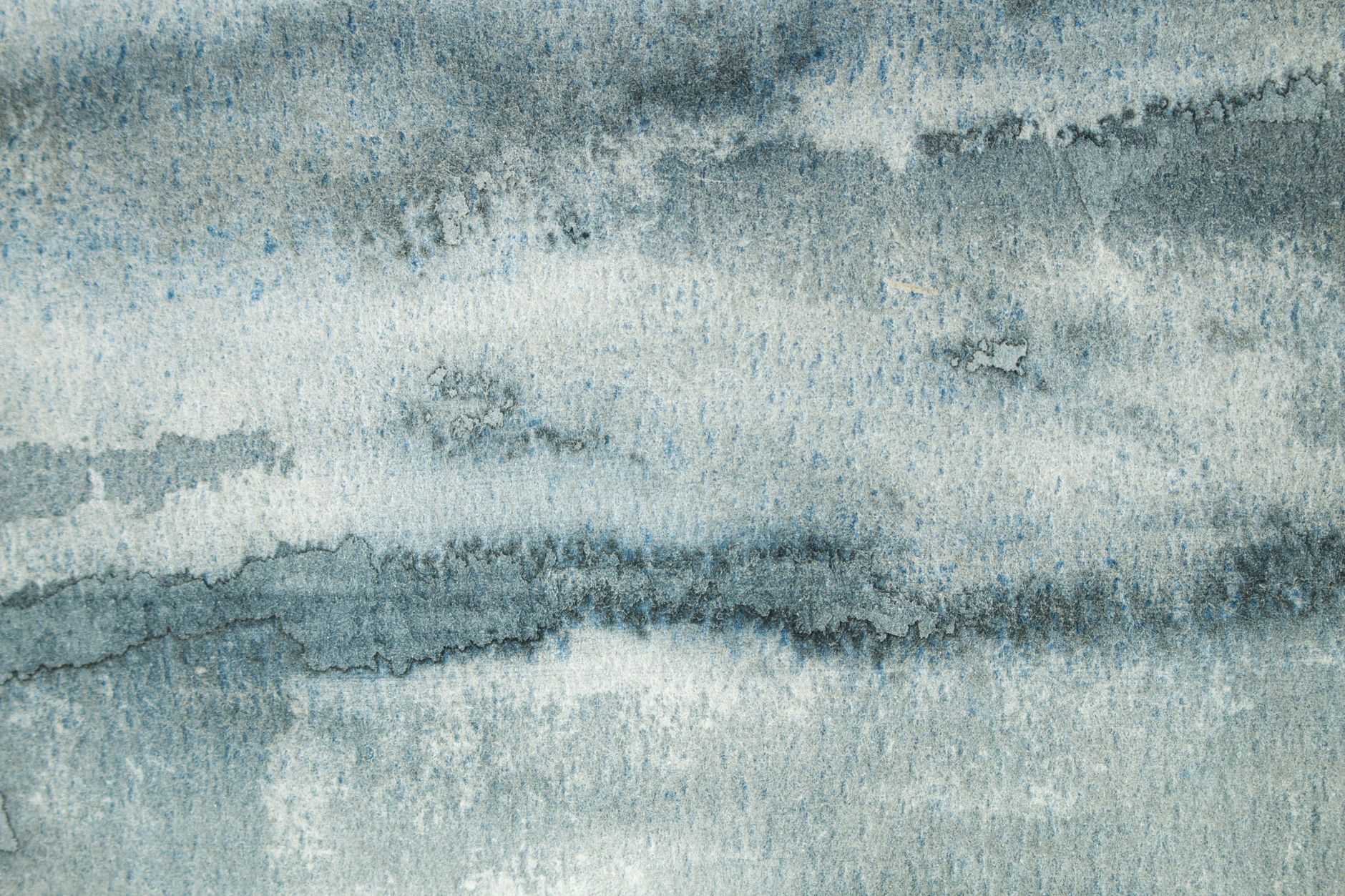
Abstract fabric prints sit in one of the most interesting corners of custom fabric design. They're not representational like a floral, not as structured as a geometric, and not rooted in a specific cultural moment the way novelty prints are. What they offer instead is mood: an emotional tone you can build a whole project around. Done well, an abstract print is the most versatile thing in your stash. Done poorly, it's the fabric you keep moving to the back of the shelf.
What counts as an abstract print?
Abstract prints cover a wide range of styles. Watercolour washes, ink splashes, painterly strokes, organic blob shapes, marbled effects, and loose brushwork all fall under the umbrella. The defining quality isn't chaos: it's that the design doesn't depict a recognisable object. A splashy floral that dissolves into colour fields is abstract. A tight, realistic botanical illustration is not.
That distinction matters because it shapes how the print reads at distance. Representational prints give the viewer something to identify quickly. Abstract prints communicate through colour, movement, and texture. The viewer's brain doesn't parse "what is that?" It just responds to feeling.
Where abstract prints genuinely shine
Garments benefit enormously from abstract prints, especially when the silhouette is simple. A boxy linen top in a moody ink-wash print does more visual work than the same top in a solid, without competing with the cut the way a dense novelty print might. The abstract quality lets the colour lead.
Home décor projects are another strong fit. Cushion covers, tote bags, and fabric baskets with abstract prints read as considered and design-forward rather than themed. They sit alongside other objects in a room without fighting for dominance. If you're sewing pieces to sell at markets or in an online shop, an abstract print can appeal to buyers who'd never reach for a cartoon or a holiday motif.
Accessories are perhaps the best use of all. A scrunchie or a zipper pouch in a striking abstract print becomes a focal point precisely because the scale is small. The buyer gets a hit of the design without committing to wearing a full abstract garment, which is a lower barrier to purchase and one reason abstract prints tend to move well in small-makes formats.
When abstract prints cause problems
The trouble starts when an abstract print is chosen for the wrong scale. A large, painterly splash print on a child's size 2 t-shirt loses most of its composition. The fragment the viewer sees bears no relation to the full repeat, and the piece looks unintentional rather than artistic. Scale matching matters more with abstract prints than with almost any other category, because the design has no recognisable motif to anchor it.
Direction is a second common problem. Some abstract prints look fine in any orientation. Others have an implicit "up" because of the way the brushwork flows or where the colour concentrates. Cut those prints without checking orientation and you'll end up with panels that fight each other at the seam. It's worth laying out your full cut before touching the scissors.
Abstract prints can also misfire when paired with busy construction. A design with lots of piecing, exposed zipper details, or intricate pintucks competes with an abstract print rather than complementing it. The print wants space. Give it a clean canvas or step back and choose a solid.
Colour is doing most of the work
With a floral or geometric, the motif carries the design. With an abstract print, colour is the primary communication tool. This means the palette choice matters more than it does for almost any other print category. A high-contrast abstract in black and white reads bold and graphic. The same composition in dusty rose and sage reads soft and organic. Same brushwork, completely different market appeal.
Fabric by TrishaMakes has seen consistent demand for abstract prints in the moody, desaturated end of the spectrum: deep teals, warm terracottas, and washed greens that sit comfortably alongside the shift toward moody earth tones that has been reshaping custom fabric palettes over the past few years. The bright, high-saturation abstract prints that dominated earlier trends have given way to something more intentional and layered.
Mixing abstract prints with other designs
One of the skills experienced sewists develop is knowing how to mix prints. Abstract prints are actually the easiest category to mix because they're not carrying a specific motif that clashes. A small abstract spot or texture print will sit quietly alongside a bolder botanical, a stripe, or a geometric, providing contrast in scale without visual conflict.
The rules are straightforward. Keep the colour palette consistent across prints (two or three shared tones is enough). Vary the scale deliberately: one large, one small, one mid-sized. Avoid mixing two prints that have the same energy, meaning two that are both soft and washy, or both sharp and high-contrast. The contrast between them is what makes the combination work.
If you're newer to print mixing and want a structured starting point, a capsule fabric approach is genuinely useful here. Choosing a small number of prints that are designed to work together, including one abstract and one geometric or botanical, gives you more flexibility than buying prints in isolation.
Choosing the right fabric base for abstract designs
Abstract prints live or die on surface quality. A design with subtle gradients, soft transitions, or fine detail needs a fabric base that can render those qualities faithfully. Jersey and modal both handle gradients and watercolour effects well because they accept ink evenly and hold colour with depth. A heavily textured base can interrupt a delicate abstract design and make it look muddy rather than painterly.
For garments, a smooth mid-weight jersey is a reliable choice. For structured accessories and home items, a woven cotton base gives the print crispness and prevents the design from distorting as it stretches. Not every fabric base holds a digital print equally well, so it's worth matching the base to the complexity of the design before you order.
Fabric by TrishaMakes prints abstract designs using digital printing on a range of base fabrics, with colours that stay true to screen across the full repeat. For abstract prints in particular, that colour accuracy matters: the subtle shifts in a watercolour wash or a gradient are exactly where inconsistent printing shows up first.
The honest case for restraint
Abstract prints aren't always the answer. If your project has a clear narrative purpose, a costume element, a gift for someone with a specific passion, or a piece designed to reference a particular place or era, a representational or novelty print will almost always communicate that intent more directly. Abstract prints are excellent at mood. They're not as efficient at meaning.
The best use of an abstract print is usually a deliberate one: chosen for its palette, scaled correctly for the project, and given enough visual space to breathe. When those conditions are met, an abstract print does something that very few other print categories can. It turns a simple make into something that looks considered, which is exactly what buyers at markets and in online shops are paying for.