
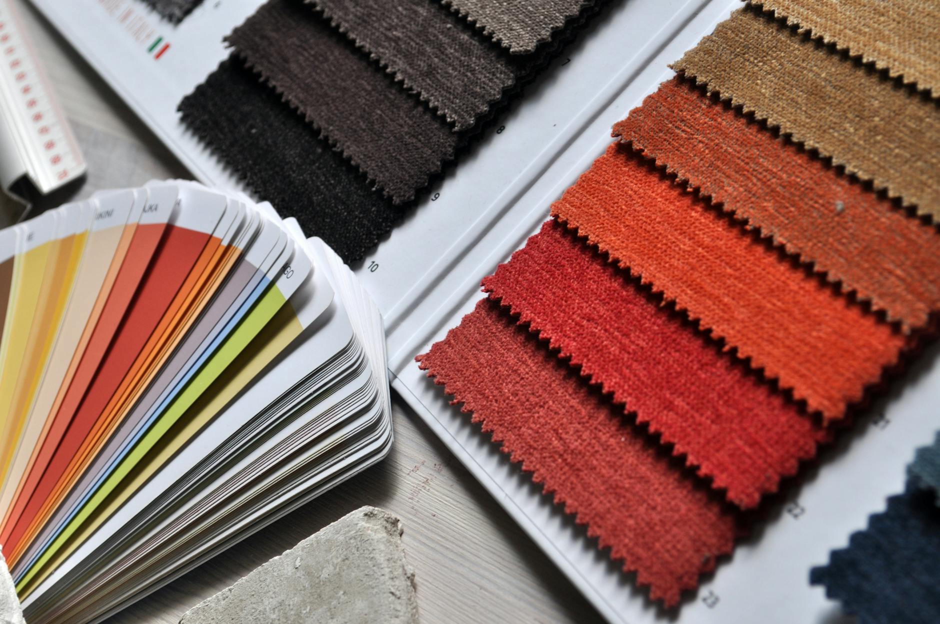
When a buyer scrolls through a fabric shop and stops at one print over another, colour is usually the first thing that made them pause. Not the pattern. Not the subject matter. The colour. Colour psychology in fabric prints is one of the least-discussed levers in custom fabric design, yet it quietly shapes preorder numbers, cart abandonment rates, and repeat purchases more than most sellers realise.
This isn't about personal taste. It's about predictable emotional responses that researchers have documented across consumer behaviour studies for decades. Understanding those responses lets you make deliberate choices rather than lucky ones.
Why colour hits before anything else
The human visual system processes colour in roughly 90 milliseconds. That's faster than the brain can register shape, text, or detail. By the time a buyer reads your fabric description or notices your print's motif, their emotional response to the colour has already formed. That response either pulls them forward or lets them scroll past.
Saturation amplifies this effect. A highly saturated red commands attention in a way that a dusty rose simply doesn't. That's not a flaw in dusty rose; it's a different instruction to the brain. High saturation signals urgency, excitement, and newness. Low saturation signals calm, quality, and restraint. Neither is inherently better. Both are tools, and the best fabric designers treat them as such.
This is part of what's driven the recent shift in preorder demand toward moody earth tones. Buyers aren't just chasing aesthetics. They're responding to the psychological signals those palettes send: groundedness, warmth, and a sense of considered quality that the brighter trend palettes of previous years didn't offer.
What specific colours tend to do in a fabric context
Colour psychology isn't universal across all industries, but fabric sits close enough to fashion and home goods that the following patterns hold reliably.
Red and warm orange drive urgency and appetite. In fabric, they perform well for statement pieces and children's prints, but they fatigue quickly when used across a wide range collection. One or two hero prints in a warm red will sell; a twelve-print range in the same register tends to cannibalise itself.
Blue, particularly mid-to-deep blue, is consistently the most trusted colour across consumer research. It signals reliability and calm. In fabric, it's one of the safest base tones for prints aimed at adults, home goods, and anything marketed as a gift. Navy in particular almost never reads as the wrong choice.
Green has broadened its associations considerably in recent years. Beyond its natural and organic signals, deeper greens now carry a strong premium feel. Sage and olive remain popular because they photograph beautifully and read as intentional rather than default.
Yellow is the highest-risk primary colour in fabric design. It's the first colour the eye detects, which makes it attention-grabbing in small doses. As a dominant tone across a print, it tips quickly into difficult, especially under artificial lighting where it can appear sickly. Use it as accent, not as ground.
Black and near-black carry strong associations with sophistication and edge. They also solve a practical problem for buyers: black base prints are genuinely versatile, which removes hesitation at the point of purchase. This is partly why the villain era fabric print trend has had such commercial staying power. Dark palettes aren't just fashionable; they're commercially logical.
Saturation and tone: the levers most designers overlook
Most conversations about colour psychology stop at hue. That's only one variable. Saturation (how vivid or muted a colour is) and tone (whether a colour has been lightened with white, darkened with black, or muted with grey) change the emotional message completely.
Pastel versions of a colour carry entirely different associations to their saturated counterparts. Pastel blue reads as infant, soft, gentle. Mid-tone blue reads as professional. Deep navy reads as authoritative. Same hue. Three completely different buyer profiles.
This is worth considering when you're building a range. If your palette is internally consistent on saturation and tone, buyers instinctively understand who the range is for. A mix of pastels and deep saturated tones in the same collection creates visual noise that makes decisions harder. Harder decisions mean fewer sales.
When thinking about which palettes work across different fabric types, it also helps to understand how the base fabric affects the final colour output. Digital printing reproduces colour differently depending on the base material, which is worth factoring in before you commit to a palette. The article on which fabrics hold vibrant digital prints best covers exactly this.
Colour combinations and what they signal
Single colours are rarely the full story. Most fabric prints combine at least two or three tones, and those combinations carry their own psychological weight.
Complementary colour pairs (colours opposite each other on the colour wheel, such as blue and orange, or red and green) create visual tension that reads as energetic and bold. They work well for statement prints aimed at confident buyers. They're harder to coordinate with existing wardrobes, which can be a barrier for buyers who shop cautiously.
Analogous palettes (colours sitting next to each other on the wheel, such as green, teal, and blue) feel harmonious and easy to wear. They're lower-risk for buyers and tend to convert well because they're less polarising. They can also read as safer or less distinctive, which matters if your brand is built on standout design.
Neutrals used as the dominant tone with one accent colour is a commercially reliable formula. It reduces decision fatigue for buyers because coordination is obvious. This is part of why capsule-thinking has entered the fabric purchasing conversation. Buyers increasingly want prints that work together, and neutral-dominant palettes make that easier. The capsule fabric wardrobe approach explores this shift in more detail.
Colour trends vs colour psychology: knowing which is driving demand
Not every colour decision is about psychology. Some demand is purely trend-driven: a colour appears on a runway, filters through social media, and suddenly everyone wants it on their fabric. The challenge is knowing whether you're seeing sustained psychological pull or a short-lived trend spike.
A useful distinction: colours that persist across multiple trend cycles usually have a strong psychological anchor. Navy hasn't gone anywhere because trust doesn't go out of fashion. Sage green has stayed because its associations with calm and nature are genuinely stable. A neon chartreuse might spike for a season because it's novel, but novelty isn't a psychological anchor. It burns fast.
When you're deciding whether to build a colour into a core range or treat it as a limited print, ask whether the emotional response it triggers is durable. Excitement is not durable. Calm, trust, warmth, and energy are. Design to those, and trend-chase only where it makes commercial sense to do so.
Colour psychology won't make a weak design succeed. But applied to a strong design, understanding what your palette signals to a buyer before they read a single word is one of the most practical levers you have. Use it deliberately.