
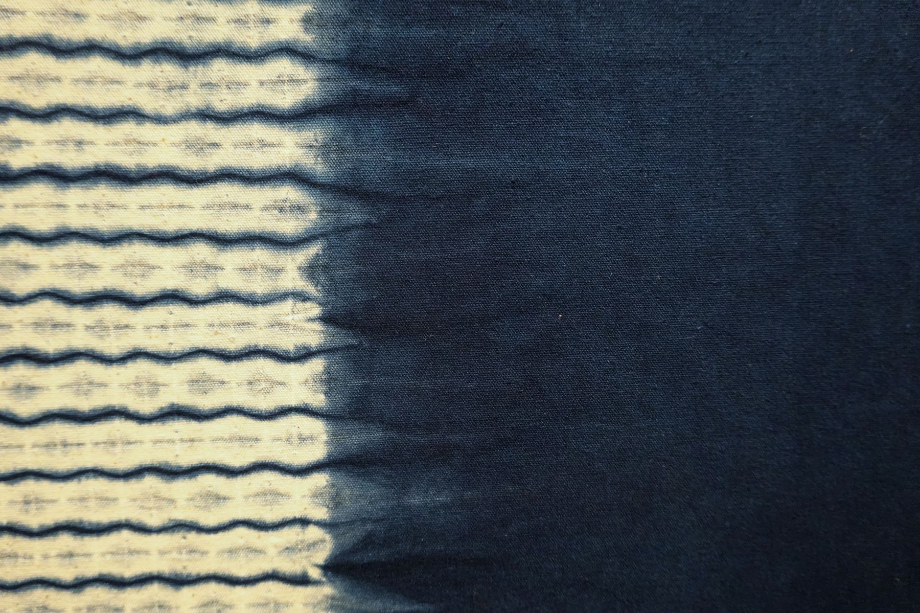
Tie-dye and gradient fabric prints are no longer a trend you wait out. What started as a lockdown-era revival a few years back has settled into something more durable: a design language that spans kids' clothing, homewares, activewear, and market stall bestsellers alike. The wash effect, the soft colour bleed, the sense of handmade movement frozen into digital print, these qualities keep buyers reaching for gradient fabrics season after season.
Why the wash effect resonates so strongly
Part of the appeal is tactile, even when the fabric isn't. A gradient or tie-dye print signals softness before the buyer has touched a thing. The blurred edges and colour transitions read as gentle, organic, and unpredictable in a way that clean geometric prints don't. That perceived softness matters particularly for children's clothing and loungewear, two of the strongest-selling categories for this print style.
There's also a personalisation angle. No two tie-dye pieces ever looked exactly alike in the original craft sense, and good digital versions preserve that sense of uniqueness even in a repeating yardage print. Buyers who want something that feels less mass-produced are drawn to prints that carry that visual individuality. It's worth noting how closely this connects to what dopamine dressing and bold print choices have been doing to buyer psychology generally: people want fabrics that feel emotionally alive, not just decorative.
The difference between tie-dye and gradient: it matters more than you think
These two print styles are often grouped together, but they behave differently on the cutting table and attract slightly different buyers.
A true tie-dye print replicates the crinkled, radiating bursts of the original resist-dye technique. Colour bleeds outward from central points, creating irregular halos and overlapping zones. The effect is energetic, sometimes chaotic, and reads as distinctly casual. It works brilliantly for kids' tees, swim cover-ups, and festival-adjacent market makes.
A gradient print, sometimes called an ombre, is a controlled, directional transition from one colour to another. It reads as calm, considered, and slightly more elevated. Gradient fabrics sell well for adult loungewear, wrap skirts, tote bags, and any project where the maker wants the colour itself to be the design statement. Matching a gradient across panels is the main technical challenge: you need to think about cut direction carefully before placing the fabric.
The practical difference for market sellers is that tie-dye prints tolerate imperfect alignment without looking wrong, while gradients reward careful planning. Neither is harder to sew, but they call for different thinking at the layout stage.
Colourways that are selling right now
Not all tie-dye and gradient palettes move equally. In 2026, the colourways with consistent preorder demand fall into two distinct groups.
The first group sits at the softer end: sage into cream, dusty rose into blush, terracotta into sand. These muted gradient fabrics overlap directly with the broader shift toward moody earth tones in custom fabric prints, and they sell to buyers who want the visual interest of a wash effect without anything that reads as loud. These prints age well in the wardrobe and photograph cleanly for online listings.
The second group leans bolder: cobalt into violet, burnt orange into golden yellow, deep teal into aqua. These are the prints that stop people at a market stall. They're especially strong for kids' clothing, beach accessories, and any project aimed at gifting. The boldest colourways tend to sell in short bursts around summer and peak gifting periods, while the muted palettes sell steadily year-round.
Sewing with gradient and tie-dye digital prints
Digital gradient prints on fabric behave like any other digitally printed fabric once they're in your hands. The print is bonded to the surface of the base cloth, so there's no bleed risk in the wash and no colour transfer to worry about when cutting or pressing. That said, a few practical habits make the results noticeably better.
Always pre-wash the fabric before cutting. Digital prints can carry a slight sizing from the printing process, and washing removes that so the finished piece drapes correctly. Press the fabric on the reverse side with a pressing cloth if you need to iron it flat before cutting: direct heat on the printed side can dull the surface over repeated contact.
For gradient prints specifically, cut all your pieces from the same length of fabric before moving anything. If you're making a garment with a front and back panel and you want the gradient to run in the same direction on both, mark your cut lines on the fabric before you make a single cut. Shifting the fabric between cuts is the fastest way to end up with panels that don't match.
Tie-dye prints are far more forgiving. Because the pattern is deliberately irregular, minor misalignment between panels is invisible in the finished piece. You can cut in any direction and the print will still read as intentional.
Projects where these prints consistently excel
The best use cases for tie-dye and gradient digital prints are projects where the fabric does most of the visual work. Simple silhouettes let the colour transition read clearly. Overly complex seam lines chop the gradient into fragments and undermine the effect.
- Drawstring bags and tote bags, where a single large panel shows the gradient in full
- Scrunchies and hair accessories, where the colour variation shows up at a small scale and still reads beautifully
- Cushion covers and pillow slips, especially with a centred gradient that fans outward from the middle
- Kids' A-line dresses and shorts, where the simple shape lets the print breathe
Zipper pouches and coin purses are another strong option: the small scale concentrates the colour into something jewel-like, and they're fast to produce in batches. If you're building a market stall range, a coordinated set of pouches in the same gradient colourway but different sizes is one of the most reliable upsell arrangements you can put on a table.
Ordering custom tie-dye and gradient fabric prints
If you're sourcing custom digital printed fabric for a tie-dye or gradient design, file preparation is the part that determines whether the result matches your vision. Gradients need to be designed at the actual print width of the fabric, with the colour transition mapped across that full dimension. A gradient that looks right at screen resolution can print banded or stepped if the colour ramp wasn't set up with sufficient bit depth.
Fabric by TrishaMakes prints custom fabric designs using digital printing onto a range of fabric bases, with preorders air freighted to keep turnaround times short. If you're designing a gradient print for the first time, a test metre before committing to a larger preorder quantity is always worth the investment. Seeing how your specific colourway renders on your chosen fabric base tells you more than any screen preview can.
The wash effect isn't going anywhere. It's one of those design styles, like florals or stripes, that keeps finding new expression each year rather than burning out. The specific colourways shift, the silhouettes it gets applied to evolve, but the underlying appeal of colour in motion is as stable as it gets in fabric design.